Establish the early foundation of Truthifi’s brand experience. While in startup phase, Truthifi was preparing their capital raise and needed clear messaging, a sharp strategic narrative, and conceptual UX direction that could guide design, product, marketing, and website development.
Learn more about Truthifi ⟶
Since Truthifi had no established brand identity, moodboards served as the starting point; defining potential directions for tone, color, typography, and overall design language.
We conducted a competitive analysis to understand how investment platforms communicate their value, present data, and frame the advisor–investor relationship. These insights informed the development of core messaging and copywriting, ensuring Truthifi’s voice felt clear, confident, and uniquely positioned.
As we continued the creative exploration, we focused on building a brand that resonated with everyday investors, not just wealthy ones. The visuals and language needed to strike the right balance between down-to-earth relatability and the credibility of an advanced, high-tech tool. The goal was to create an experience that felt simple and approachable, giving users clarity without feeling like more financial work.
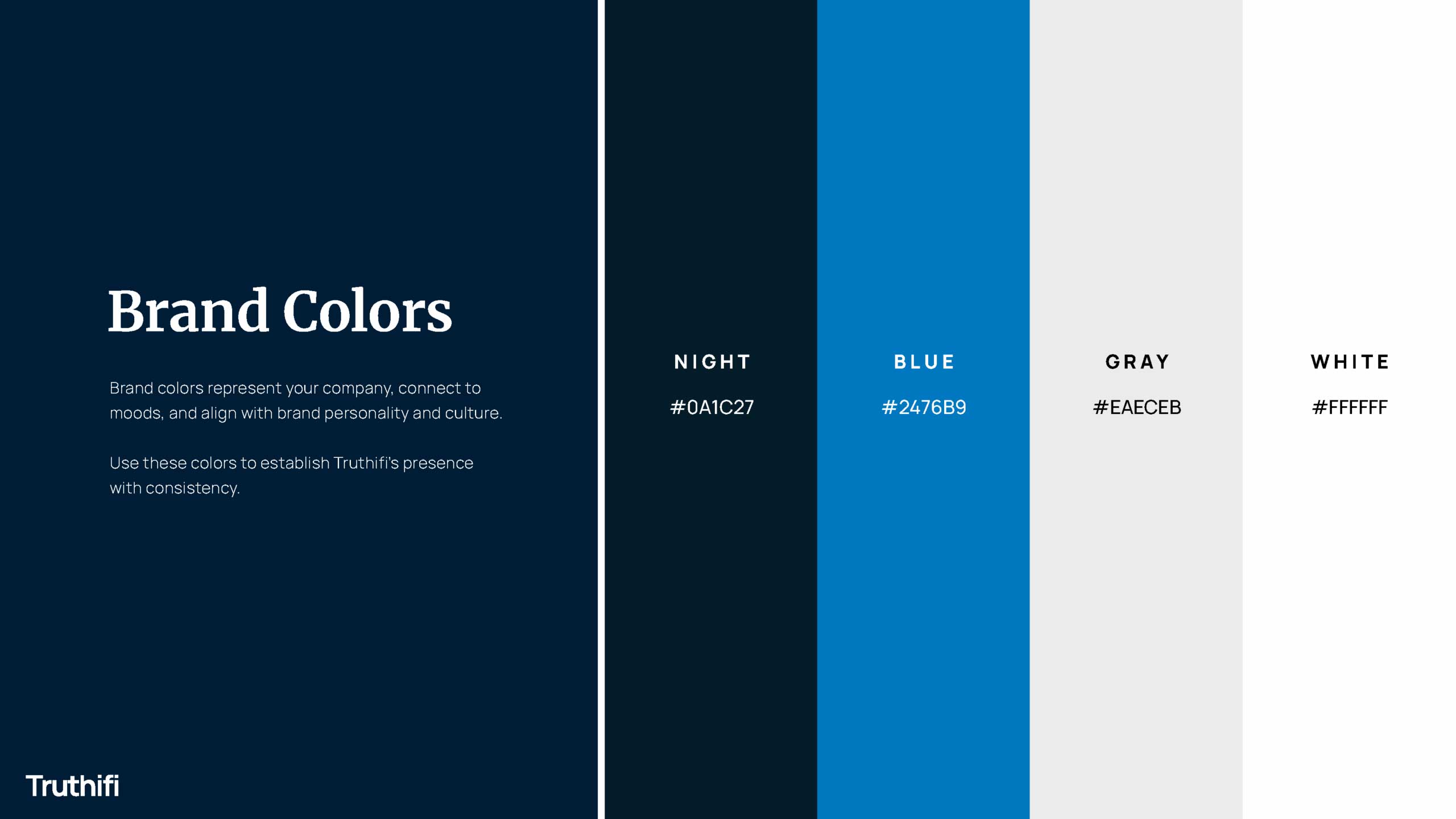
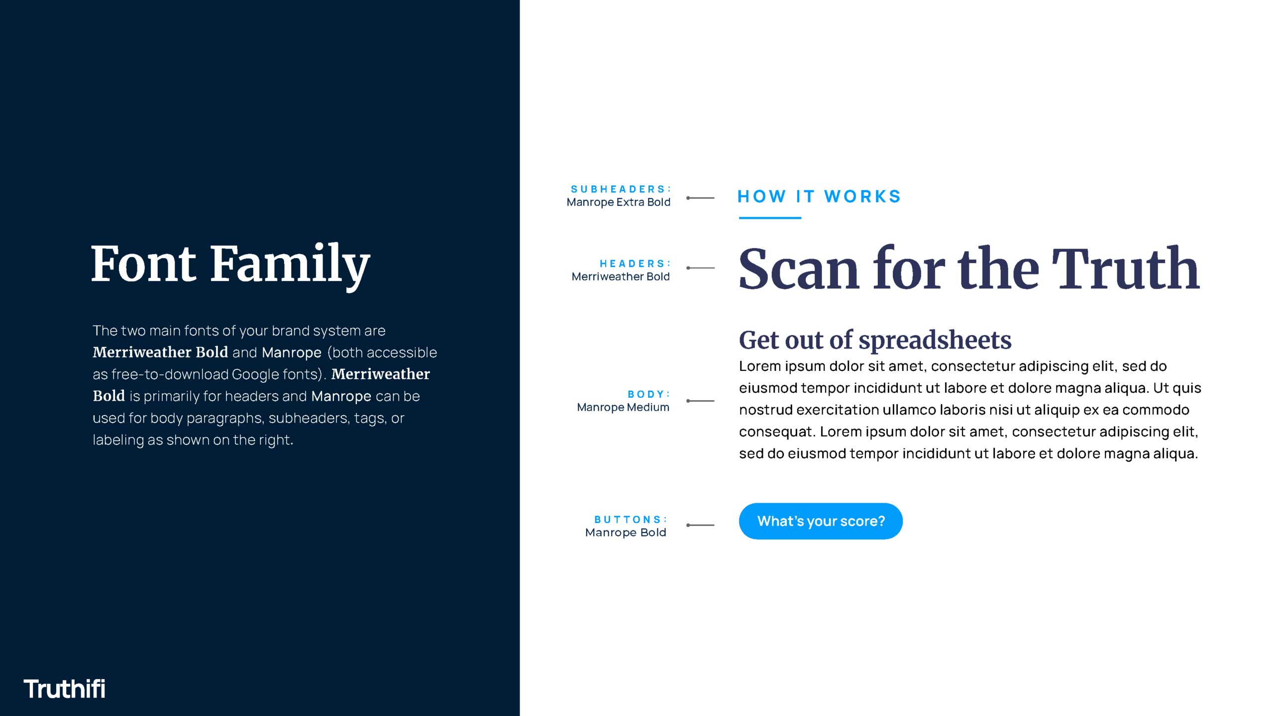
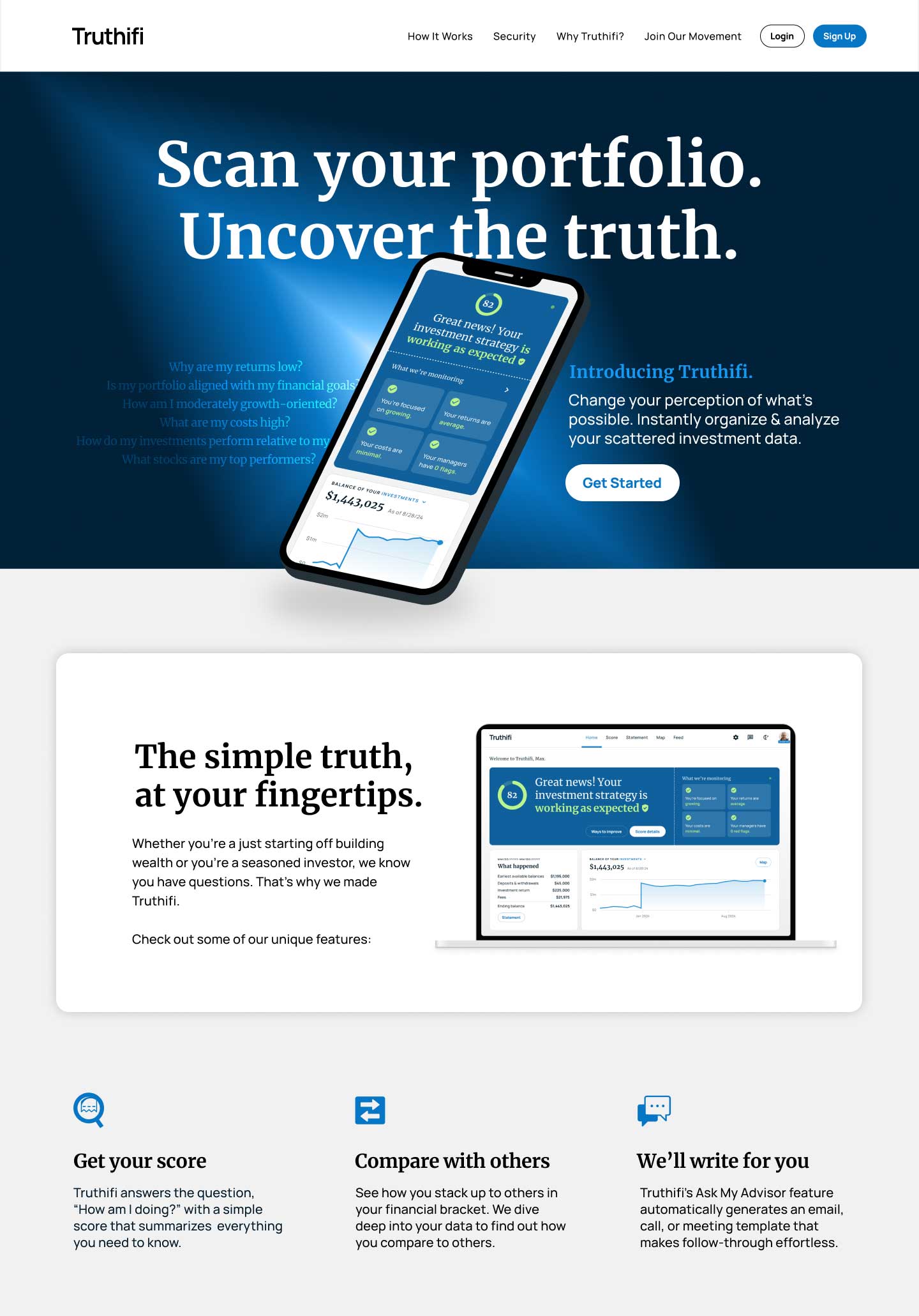
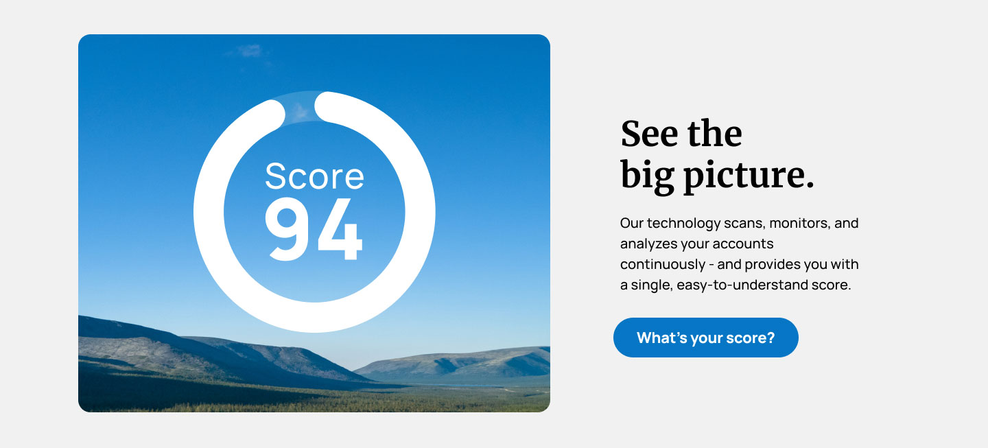
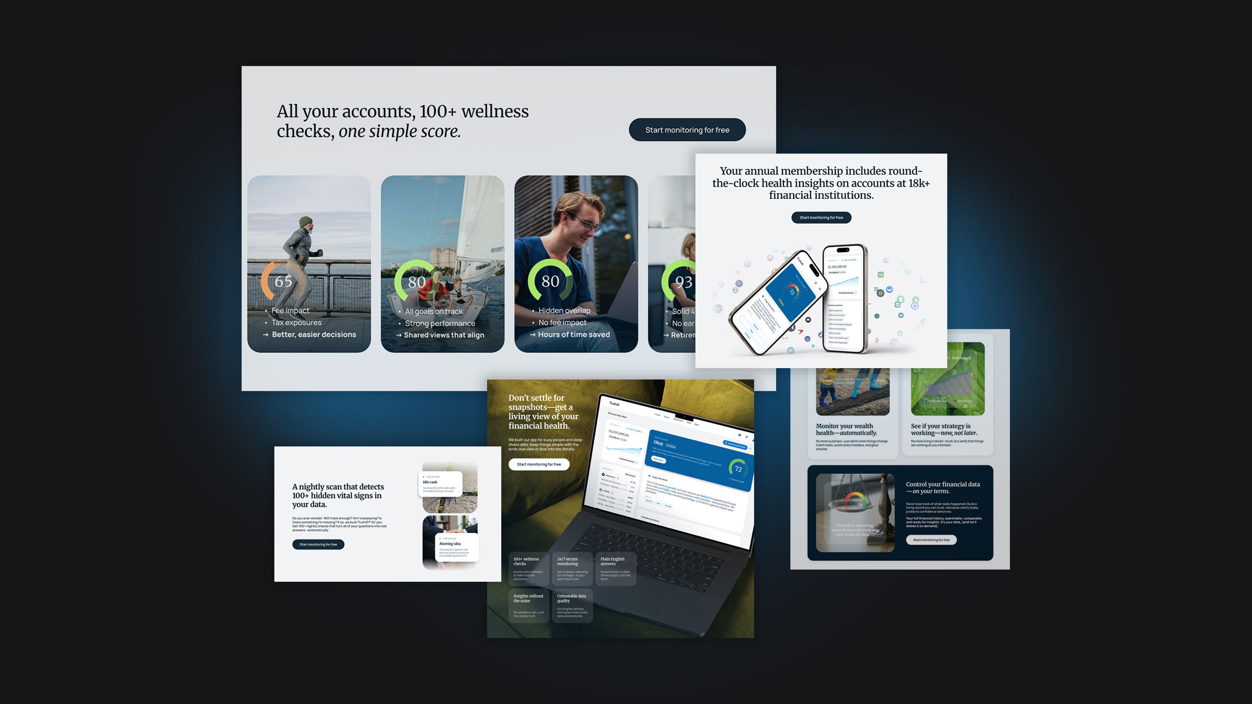
As the brand direction took shape, the visual language matured into something more elegant and editorial. We moved away from anything overly “techy” and focused on clarity, calm, and confidence.
Rich blues, cool grays, simple layouts, and real-world photography paired with product dashboards, established a refined, approachable aesthetic creating an experience that felt elevated, trustworthy, and genuine.
We intentionally avoided trendy tech brights and gradients, opting instead for a timeless palette of deep blues and soft neutrals. A classic palette of blues, grays, and whites delivers a grounded, timeless look that reinforces trust and elevates the overall brand experience.
Our type system blends the intelligence of a serif with the simplicity of a sans. Merriweather brings a sense of “smartness” and editorial sophistication, while Manrope keeps the vibe clean, approachable, and easy to read.
The photography direction focuses on relatable, real-world moments rather than traditional finance imagery. Natural light, candid expressions, and simple compositions help Truthifi feel accessible and grounded. The style reflects the brand’s commitment to empowering everyday investors. The warm, honest visuals bring humanity to a high-tech platform.
The foundational system we developed became the springboard for Truthifi’s internal team. Equipped with clear messaging, a cohesive design language, and a conceptual UX direction, they refined and extended the work in-house to deliver their final website and marketing presence.
“As an emerging fintech company, working with the KingFish team was an outstanding experience. They guided us through brand strategy, messaging, and design with clarity and creativity, helping us shape a polished, confident visual identity for Truthifi. We’re incredibly grateful for their partnership and the quality of work they delivered.”