October 10, 2024

Navigating the Discovery Process Through Competitive Analysis

Taking on a project with a new client can feel like setting sail in uncharted waters. As we embark, the implementation of a discovery phase provides us with the tools needed to navigate a unique and client-focused creative process. In addition to stakeholder interviews, a competitive analysis is an invaluable tool that provides us with crucial insights that will shape effective strategies and lead to exceptional results.

A SWOT analysis evaluates an organization’s Strengths, Weaknesses, Opportunities, Threats – and it’s not corporate jargon but a treasure trove of information. This process uncovers what keeps your competitors afloat and what could run them aground — what new opportunities competitors are exploring and where they could encounter hazards. When done correctly, the SWOT reveals critical insights that can be used to a client’s advantage, allowing them to capitalize on their competitors’ missteps and turn a competitor’s weaknesses into their strengths and threats into opportunities.

At KingFish, a SWOT typically includes a close inspection of competitor websites to evaluate user experience, content strategy, and SEO practices. Additionally, a social media assessment identifies types of content competitors create and how frequently they share it. We determine how each competitor markets themselves and how they connect with their followers and our research inspires a tailored content strategy.

This iterative process uncovers a client’s differentiators, which are the unique advantages that set an organization apart in the marketplace. These traits distinguish their products and services from key competitors and should be leveraged and amplified in order to appeal to target audiences. Understanding these differentiators will help to better navigate the competitive waters, avoid potential obstacles, and chart a course toward success.

As we dive into the realm of messaging and visual representation, we analyze how competitors position their brand and speak to their audience through voice, tone, and visual design. We use this knowledge to craft a distinctive voice and brand experience, as well as irresistible calls to action (CTA) that make our clients stand out in a sea of competitors.
Whether our client’s goal is to rebrand, launch an ad campaign, increase web traffic, develop an impactful social media presence, or drive overall brand engagement — a competitive analysis is often the first step to uncovering their organization’s unique attributes.

September 24, 2024

Hue’s Who: Why Color Psychology Shapes Branding Success and Differentiation

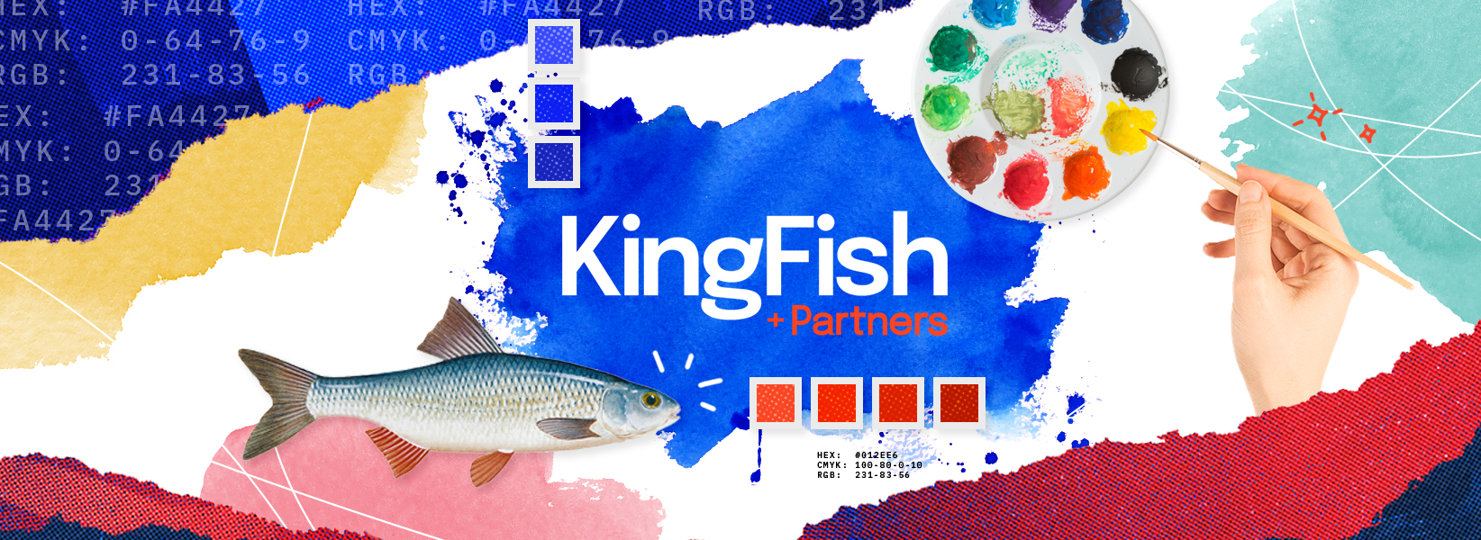
Whether to generate conversations or play off emotions, fuel hunger or create trust, humans are influenced by color. Colors are one of the most important things in the world of marketing and advertising and the significance of strong color palette cannot be overstated. Selecting the right color combo is not merely a design choice; it’s a critical factor in customer retention, brand identity, and can even help or hurt your sales.

But why are color palettes important? They affect perception, mood, brand recognition, and consistency.1 Colors influence consumer behavior in profound ways. For instance, red is often associated with excitement and urgency, making it effective for promotions and calls to action, “Add to Cart”, and “Click Here”. Orange conveys playfulness and warmth, appealing to creativity and friendliness. Think of Nickelodeon as a brand, and their orange logo will make a lot of sense. Yellow is linked to happiness and optimism, think rubber duckies, sunshine, and smiley faces. Yellow also grabs intention, Matt Groening, creator of the Simpsons, says that he made the characters yellow because: “he wanted his cartoon to be eye-catching. When someone is flipping through channels, he wanted the bright yellow color of the Simpsons to catch the eye and make them go back to watch it."2 Green represents freshness, stability, and vitality, making it ideal for brands focused on health, quality, and sustainability such as Whole Foods or Hello Fresh. Blue fosters a sense of calm and trust, therefore it’s a popular choice for financial and healthcare brands such as Blue Cross or Chase. Purple, often associated with luxury and introspection, can inspire luxury and creativity, which is consistent with Cadbury’s branding.

“When SEO company Reboot ran a study on logo recognition, 78% of participants were able to recall the primary color of the logo while only 43% were able to remember the company name.”3 This underscores how essential a consistent color scheme is for building brand identity; the most successful companies are examples of this. Tiffany blue, John Deere green, UPS brown, Home Depot orange, and Barbie pink are all recognizable to the vast majority of the US population, which is essentially free marketing and customer recognition by something as simple as a color. Some companies go as far as to trademark “their color”, to ensure originality and unique brand identity, not to confuse themselves with any other competitor or brand. Your colors should be synonymous with your brand, a big decision we know, but it can get your brand ahead and make you more recognizable, while also helping you stand out from your competitors.

Two brands that commonly stand out in this conversation are Purple and Dunkin’. In a world of neutral marketing for mattresses and sleep companies, Purple’s lavender color and marketing stick out in the best way. Sealey, Simmons, Tempurpedic, Sleeptronic, Casper, Helix, and Mattress Firm are all either blue or red, and Purple knew exactly what they were doing with their branding. They went as far as to make the mattresses themselves purple, adding to their brand recognition in the most genius way possible. This playful color and branding also make them more approachable and humorous. As for Dunkin, they stand out for their iconic color scheme, you can picture the exact shades of pink and orange when someone says Dunkin, they have been so consistent with these colors since 1960. 

The impact of color in branding is undeniable; it’s a powerful tool that shapes perceptions and drives consumer behavior. As we’ve seen with brands like Purple and Dunkin’, a well-thought-out color palette not only differentiates a brand but also creates an emotional connection with consumers. It’s more than just aesthetics; it’s about crafting an identity that resonates and sticks. When you choose your colors wisely, you’re not just painting a pretty picture—you’re laying the groundwork for recognition, loyalty, and ultimately, success. 

1: Chamber of Commerce. (n.d.). Guide to color psychology in marketing. 

2: Woolford, M. Matt Groening explains why The Simpsons are yellow. Joe.  

3: WordStream. Color Psychology in Marketing: How Colors Influence Consumer Behavior.  

Independent.
Full service.
20 years and running.

We’re always down to put heads together. Reach out to kick off a new partnership.

kingfish-logo-square
kingfish-partners-text-logo-footer-v4

© KINGFISH | KINGFISH + PARTNERS™ IS A TRADEMARK OF KING FISH MEDIA, LLC.
PRIVACY | TERMS