BRAND STRATEGY AND VISUAL IDENTIFY HELP MODERNIZE A LEADING PROPERTY MANAGEMENT COMPANY

The Andrews Organization

Objective

Rebrand and refine positioning for a premier NYC residential property management company to better represent their sophisticated clientele, extensive services, and high-touch property management provided to owners and residents of nearly 400 residential buildings across five boroughs of the city.

Check out the live site ⟶

Instruments of Creativity
001

Creating an edge

Refining a revered brand

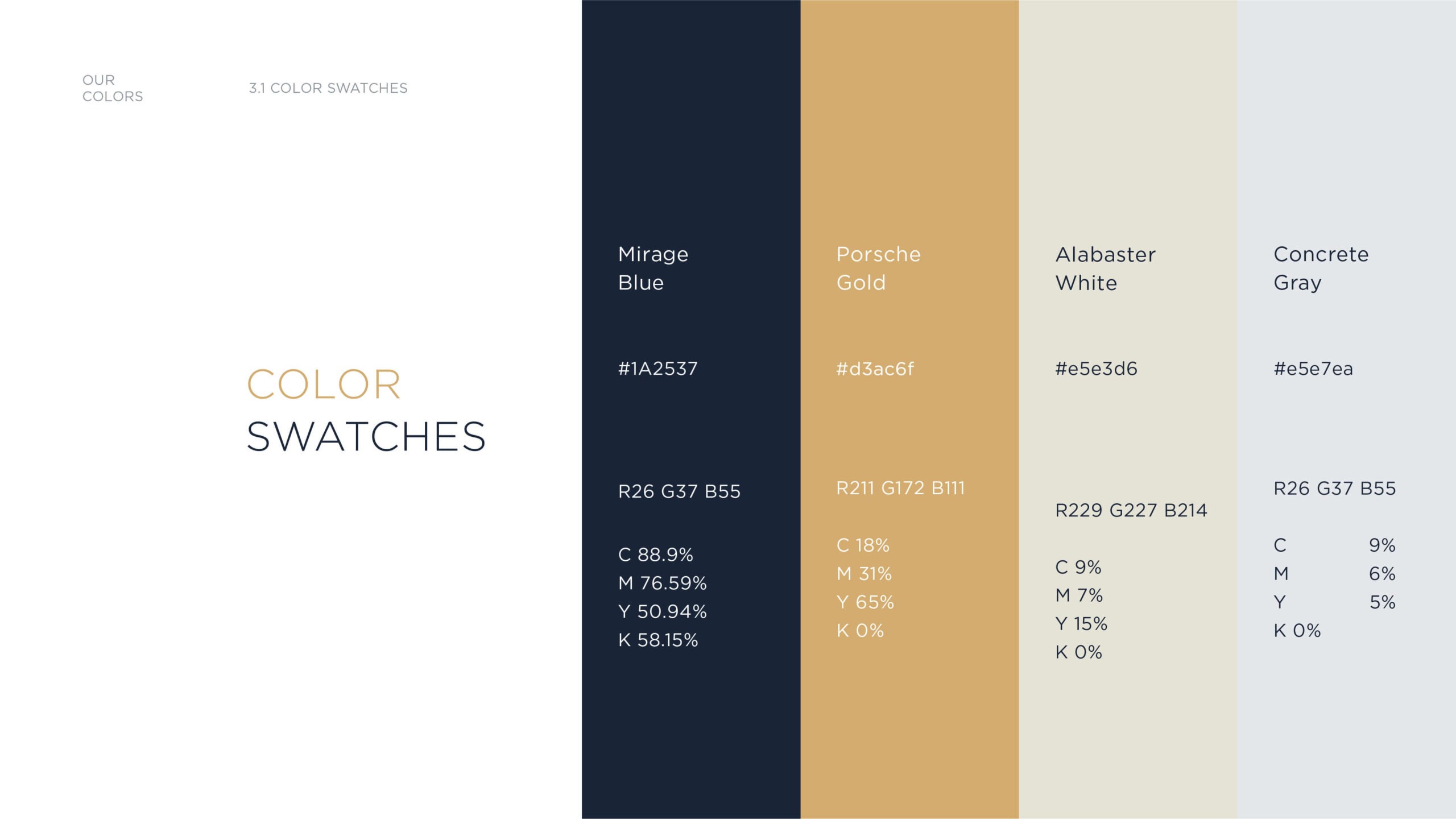
Though an extensive brand identity exploration project, KingFish created a wide variety of concepts for TAO.  The final logo was a modified version of their “A” that highlighted a new navy and gold palette with a modern stylized “A”.

EXPLORATION

Though an extensive brand identity exploration project, KingFish created a wide variety of concepts for TAO.  The final logo was a modified version of their “A” that highlighted a new navy and gold palette with a modern stylized “A”.

SIGNAGE

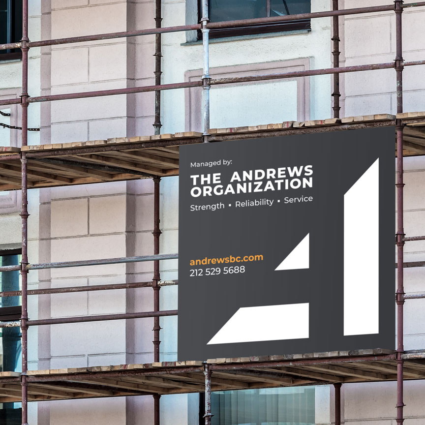
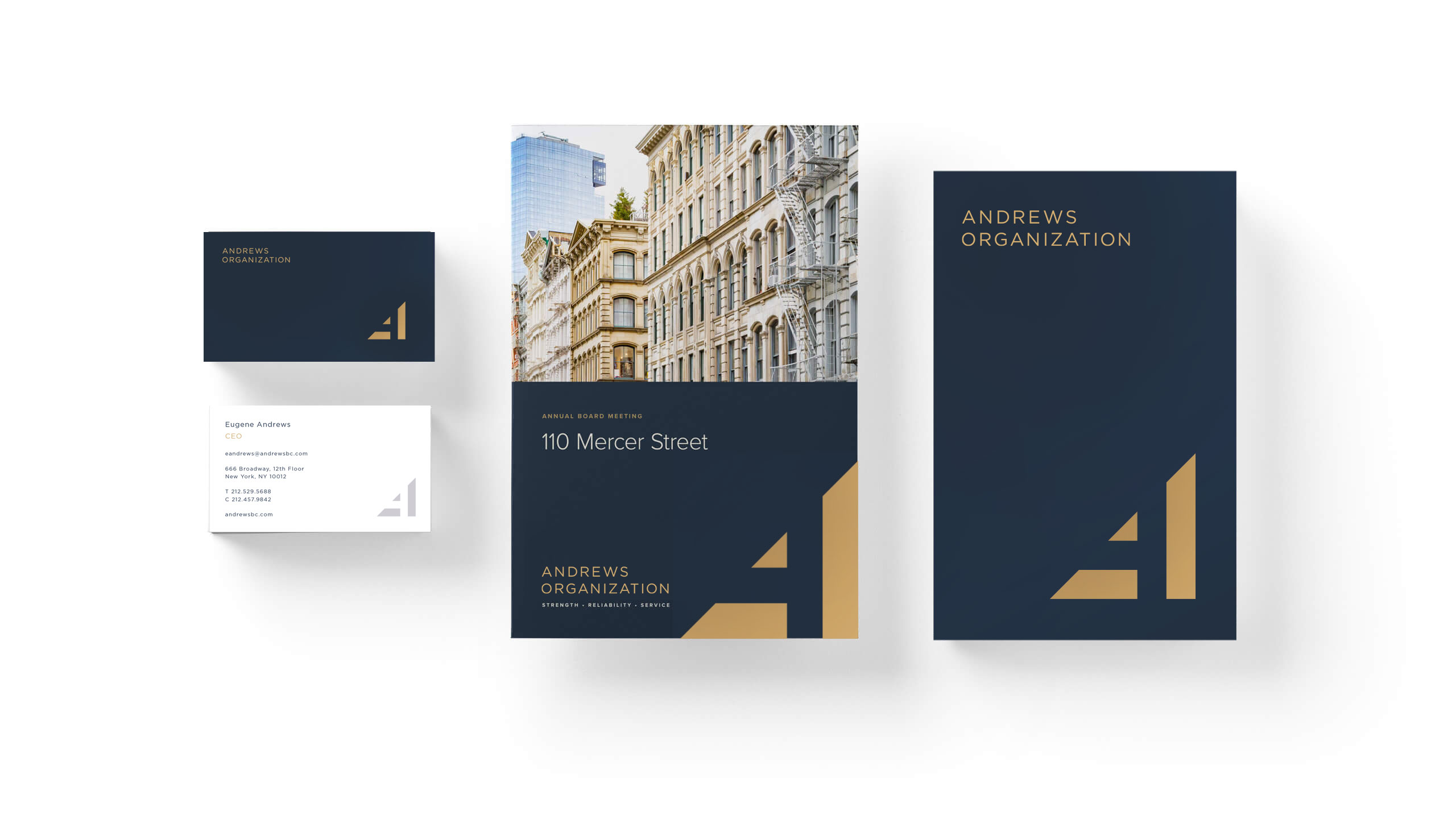
We extended the brand across various touchpoints, including signage. We created a more sophisticated visual language that’s scalable, clean and recognizable in a crowded NYC marketplace.

BRAND GUIDELINES

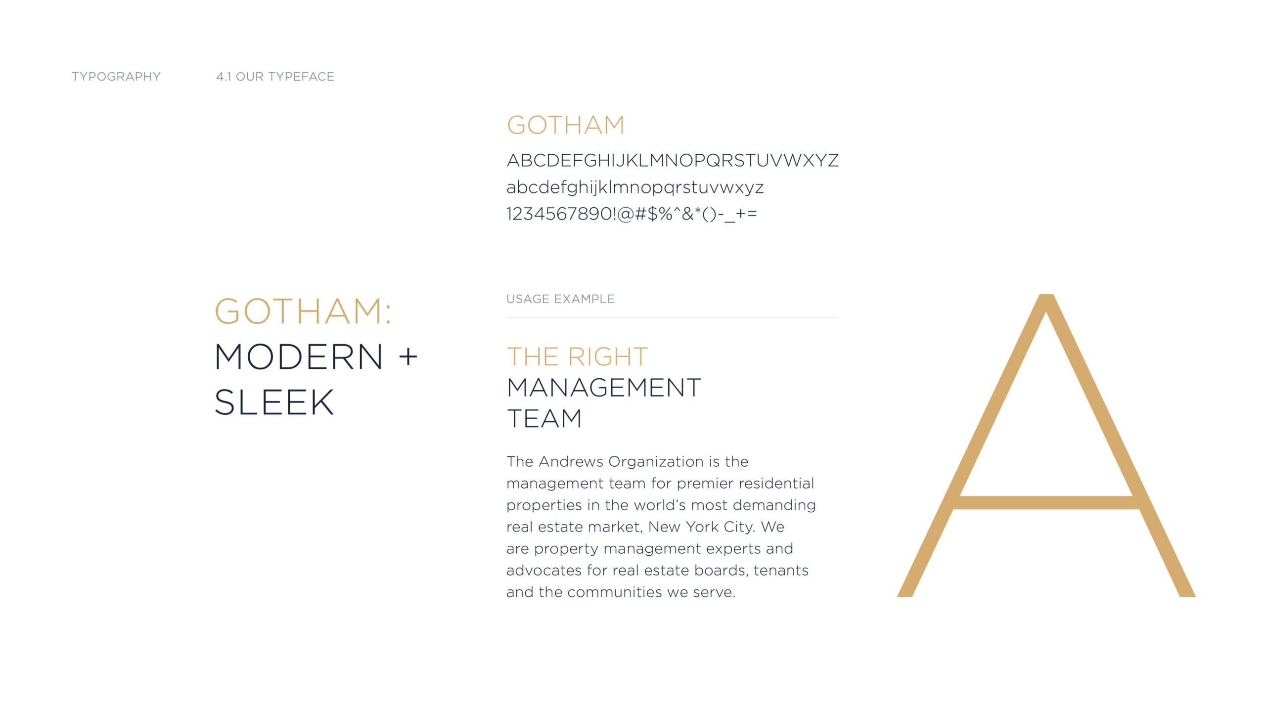
A comprehensive brand guidelines document was created to ensure consistent usage across all channels. We outlined tone of voice, use of photography, color, typography and more.

002

Clean and engaging design

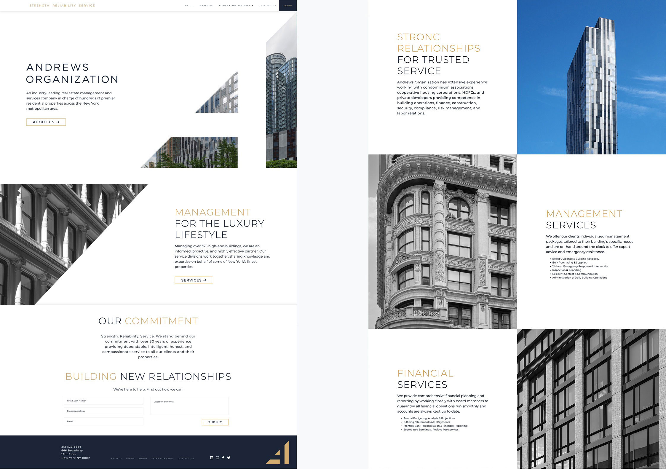
The sites pages feature original photography of TAO managed buildings and their team.  Subtle design elements are included to engage site views as pictures change from black and white to color as users hover over them.  The purposeful use of the navy and gold accents helps to reinforce the high-end nature of the company’s properties, projects, and services.

CLIENT PORTAL

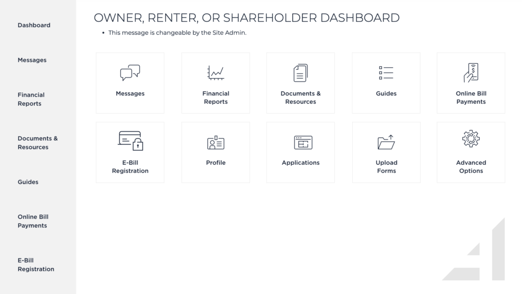
A client portal was also designed to facilitate communication between The Andrews Organization and their various stakeholders. 

The Andrews Organization - B2B / Real Estate

The Andrews
Organization -
Brand Identity,
Website, and
Signage

Questions about how KingFish + Partners approached this engagement – and what the work means for organizations in similar situations.
What brand work did KingFish + Partners do for The Andrews Organization?

The Andrews Organization is a premier NYC residential property management company managing nearly 400 buildings across all five boroughs. KingFish + Partners led a comprehensive brand repositioning and identity refresh – developing new logo concepts through an extensive exploration process, arriving at a modernized letter A in a refined navy and gold palette. The engagement covered brand guidelines, website design featuring original photography of TAO-managed buildings and team, and signage system design. The brief was to better represent the sophisticated clientele, extensive service range, and high-touch property management that define The Andrews Organization.

Rebranding a B2B real estate organization requires understanding the credibility signals that matter to its primary audience. For a property management company serving building owners and residents of premium residential properties, the brand needs to project professionalism, sophistication, and attention to detail. KingFish + Partners explored a wide range of identity directions for The Andrews Organization before arriving at a solution that evolved the existing mark – preserving equity built into the A symbol while modernizing with clean geometric forms, elegant wide-kerned serif typography, and a refined color palette appropriate to the premium market segment.
Brand guidelines for a property management company document all elements needed for consistent execution across physical and digital touchpoints: logo usage rules and clear space, primary and secondary color systems, typography with usage specifications, photography style direction for buildings and team, tone of voice guidance, and application examples across business cards, signage, marketing materials, and digital channels. For The Andrews Organization, the guidelines were designed to give internal teams and external vendors clarity for consistent brand representation across nearly 400 buildings.

A property management company website serves building owners evaluating management partners and current residents looking for property information. Effective design must project the professionalism attracting new building owners while being practically useful for existing residents. For The Andrews Organization, KingFish + Partners designed a site around original photography of managed properties and team members – creating an authentic impression that stock imagery cannot replicate.

Yes. In addition to The Andrews Organization, brand and website work includes Ascot Group rebrand and website in specialty insurance, CSI messaging and website redesign in fintech and regtech, HouseWorks brand identity in home health care, and Salem Waterfront Hotel repositioning and website. Contact us at kingfishmedia.com/contact to discuss your brand or marketing needs.

Next case study
COPYWRITING & WEB DESIGN