


UNLOCKING FINTECH STARTUP GROWTH WITH BRAND STRATEGY, MESSAGING AND VISUAL IDENTITY
Truthifi
Objective
Establish the early foundation of Truthifi's brand experience. While in startup phase, Truthifi was preparing their capital raise and needed clear messaging, a sharp strategic narrative, and conceptual UX direction that could guide design, product, marketing, and website development.
Learn more about Truthifi ⟶
Instruments of Creativity
Competitive analysis
Brand foundations
Messaging + copywriting
UX/UI concepting

001
Shaping the vision


BRAND EXPLORATION
Since Truthifi had no established brand identity, moodboards served as the starting point; defining potential directions for tone, color, typography, and overall design language.
COMPETITIVE INSIGHT & MESSAGING DEVELOPMENT
We conducted a competitive analysis to understand how investment platforms communicate their value, present data, and frame the advisor–investor relationship. These insights informed the development of core messaging and copywriting, ensuring Truthifi’s voice felt clear, confident, and uniquely positioned.
002
Financial clarity
for real people
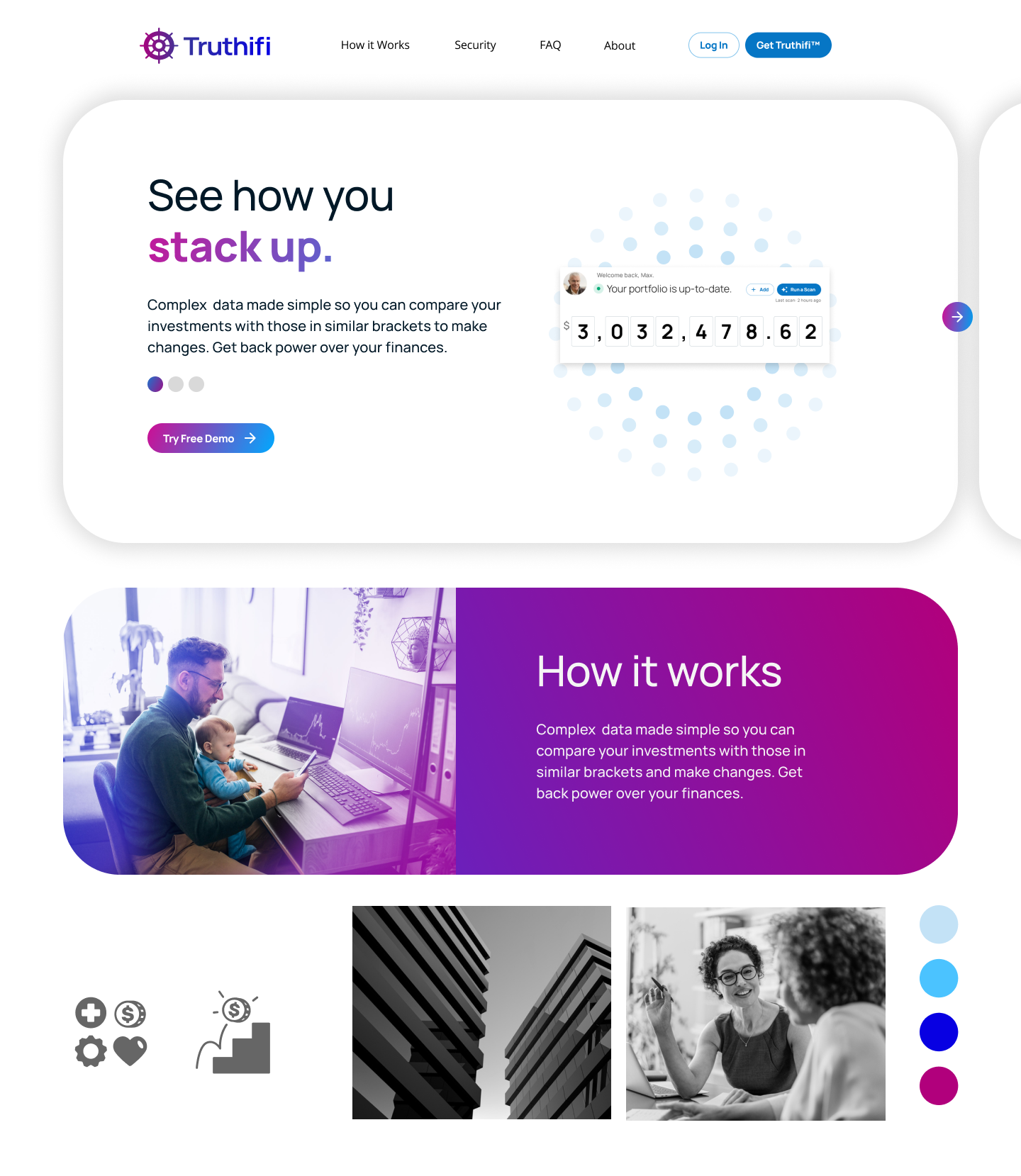
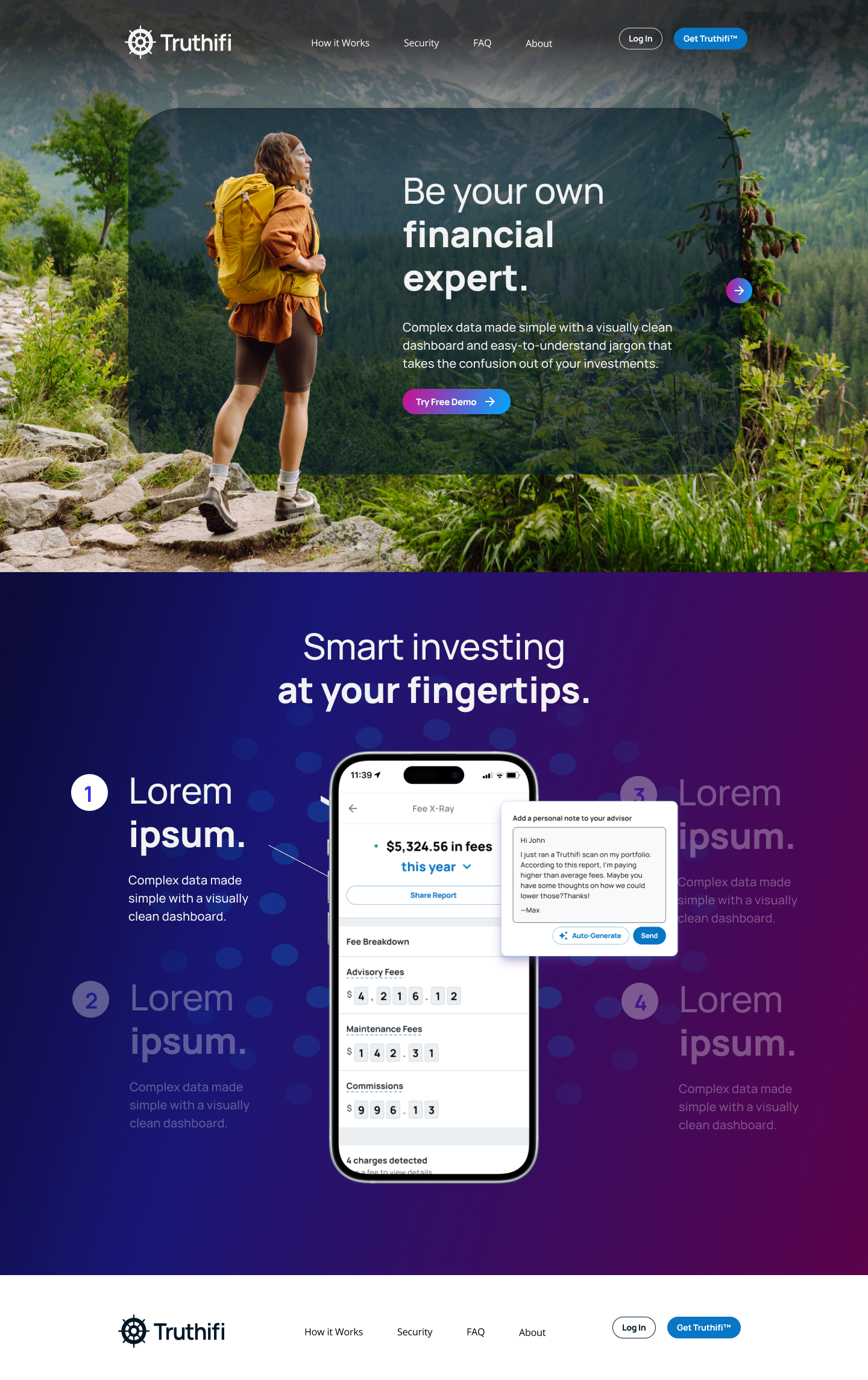
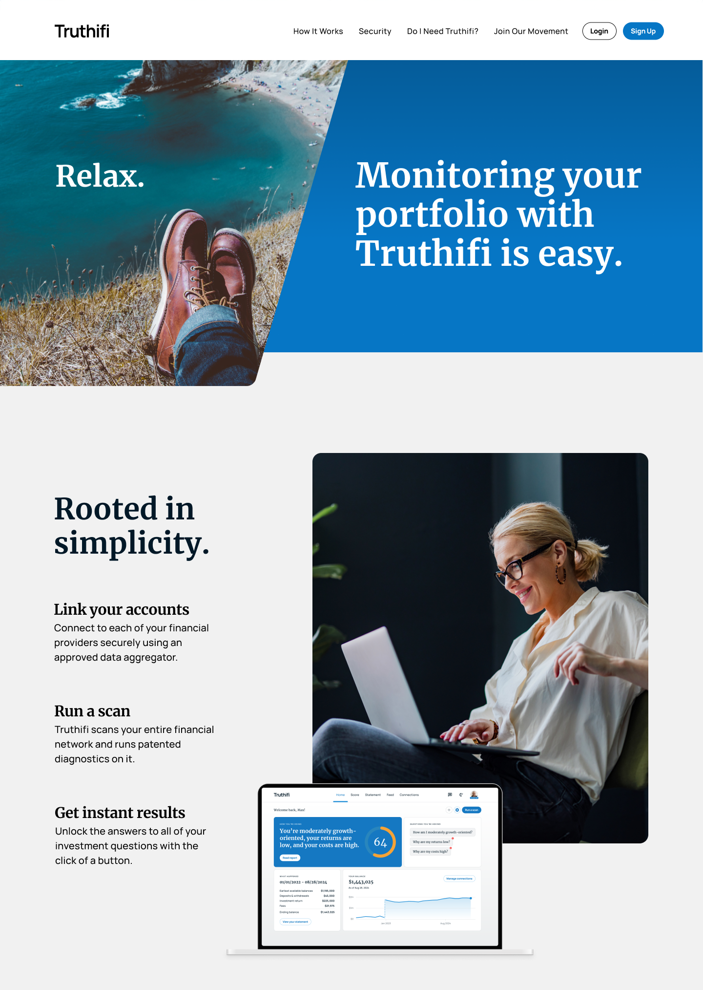
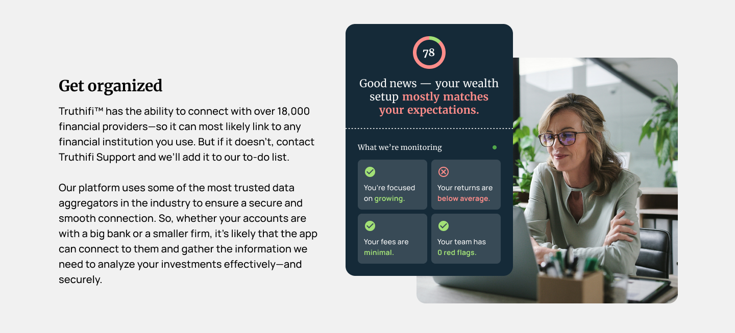
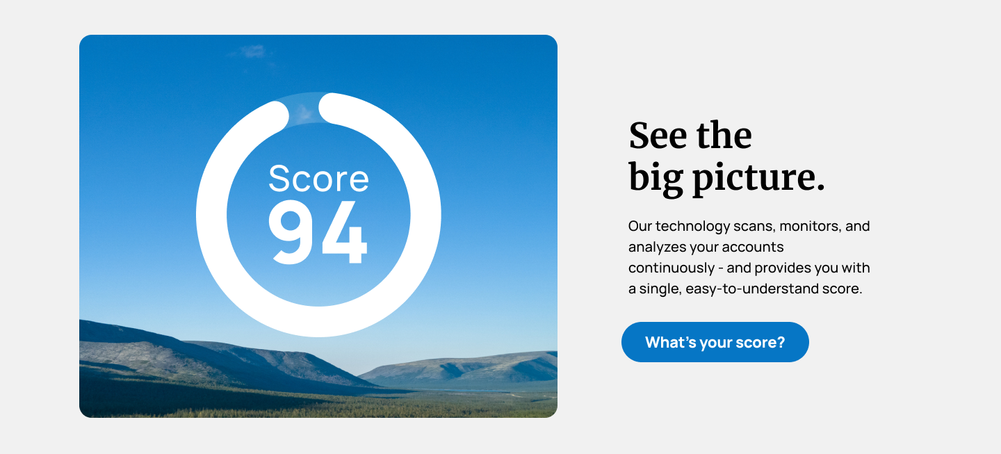
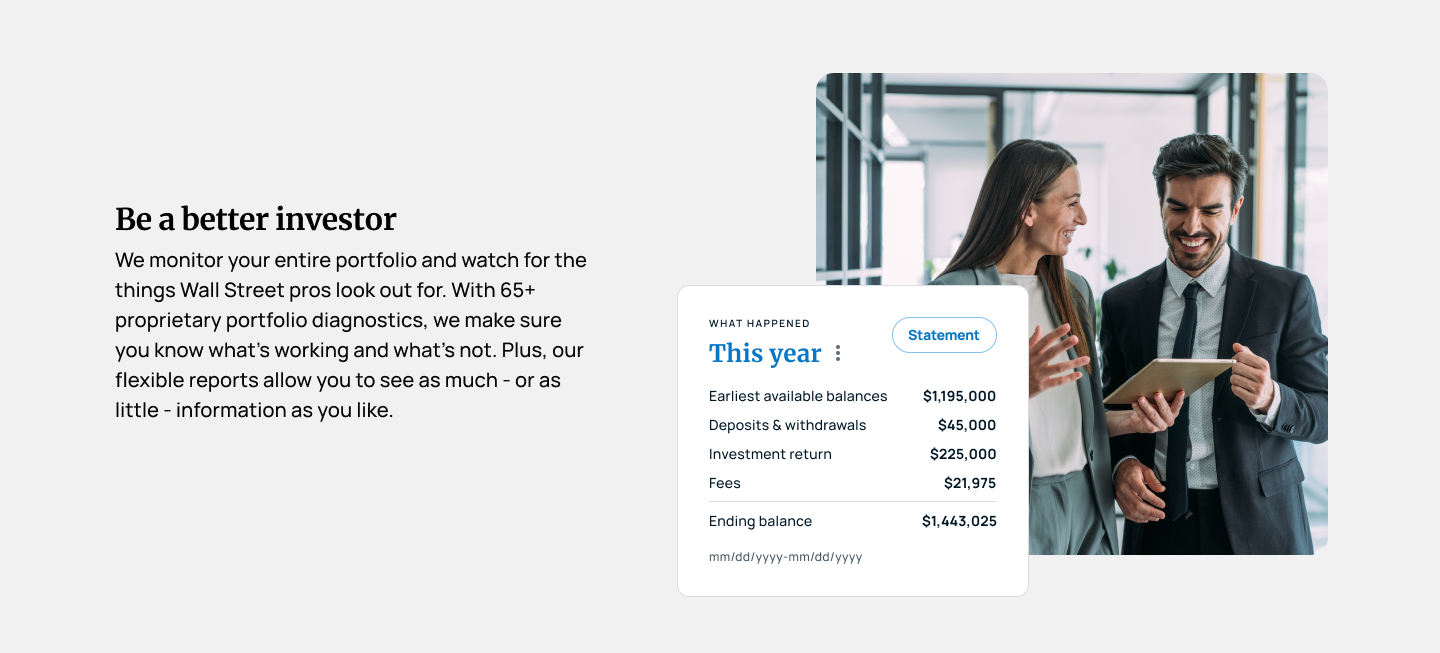
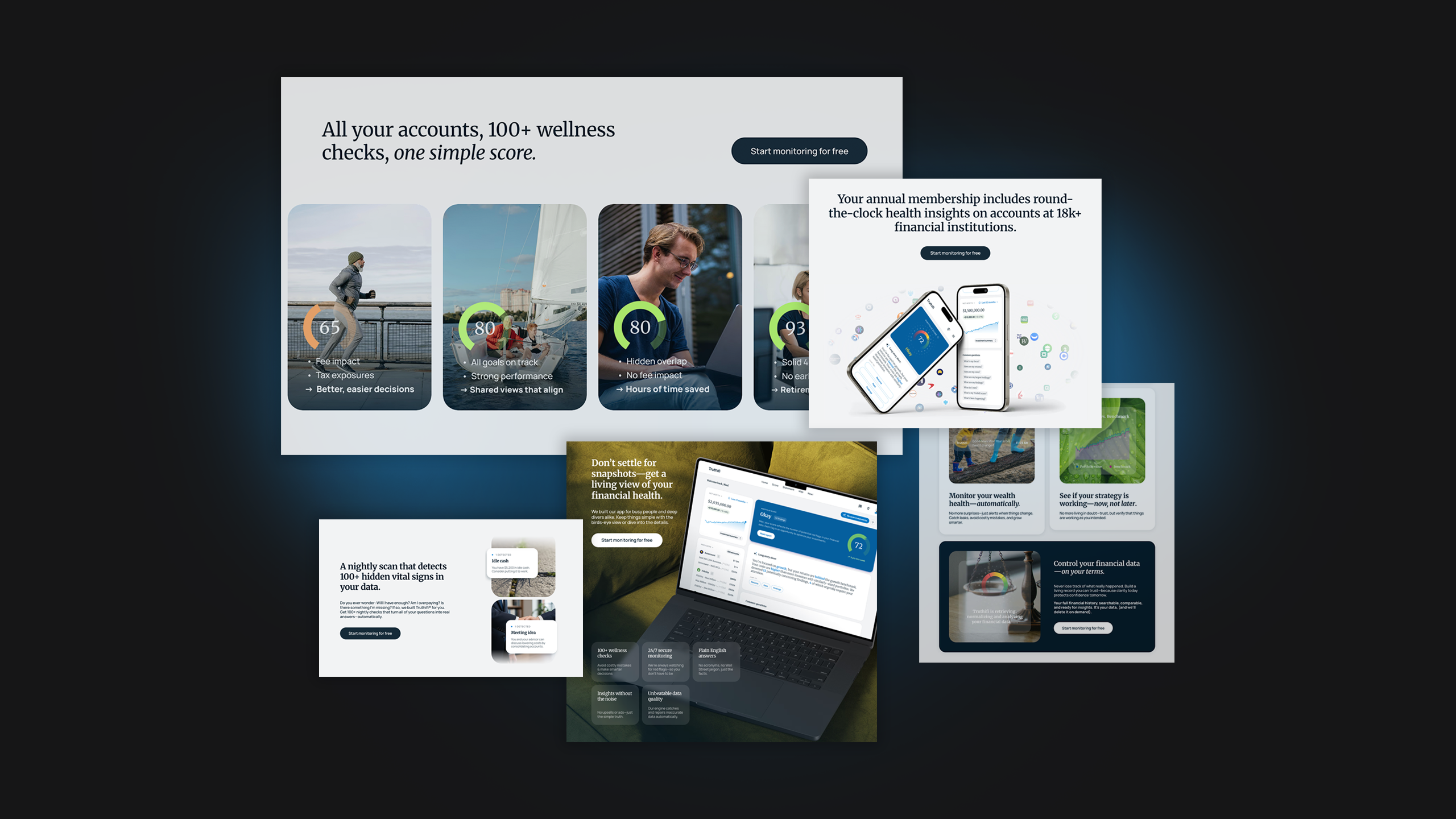
As we continued the creative exploration, we focused on building a brand that resonated with everyday investors, not just wealthy ones. The visuals and language needed to strike the right balance between down-to-earth relatability and the credibility of an advanced, high-tech tool. The goal was to create an experience that felt simple and approachable, giving users clarity without feeling like more financial work.
Elegant confidence
As the brand direction took shape, the visual language matured into something more elegant and editorial. We moved away from anything overly “techy” and focused on clarity, calm, and confidence.
Rich blues, cool grays, simple layouts, and real-world photography paired with product dashboards, established a refined, approachable aesthetic creating an experience that felt elevated, trustworthy, and genuine.

BRAND COLORS
We intentionally avoided trendy tech brights and gradients, opting instead for a timeless palette of deep blues and soft neutrals. A classic palette of blues, grays, and whites delivers a grounded, timeless look that reinforces trust and elevates the overall brand experience.
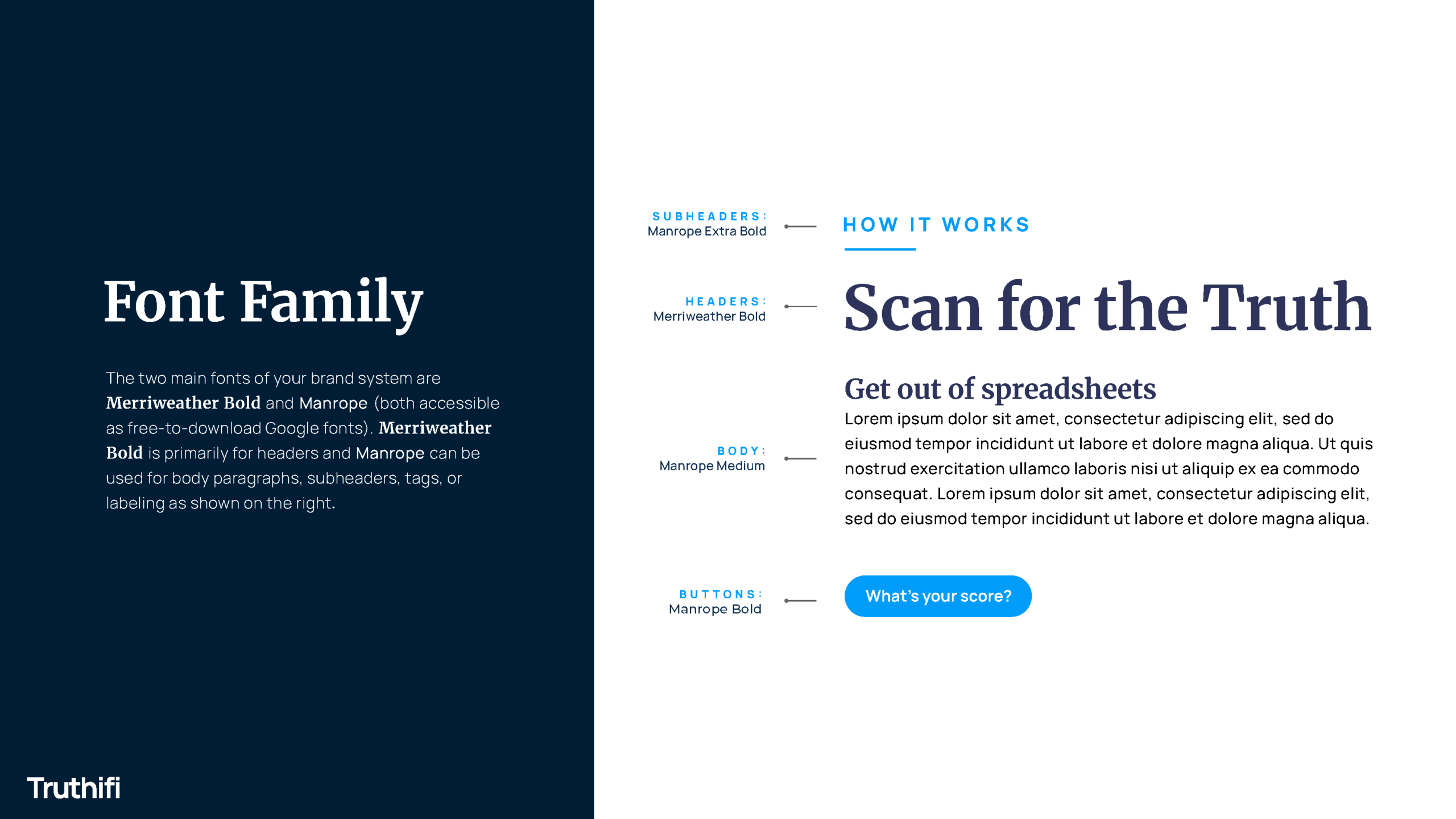
BRAND FONTS
Our type system blends the intelligence of a serif with the simplicity of a sans. Merriweather brings a sense of "smartness" and editorial sophistication, while Manrope keeps the vibe clean, approachable, and easy to read.
VISUAL SYSTEM
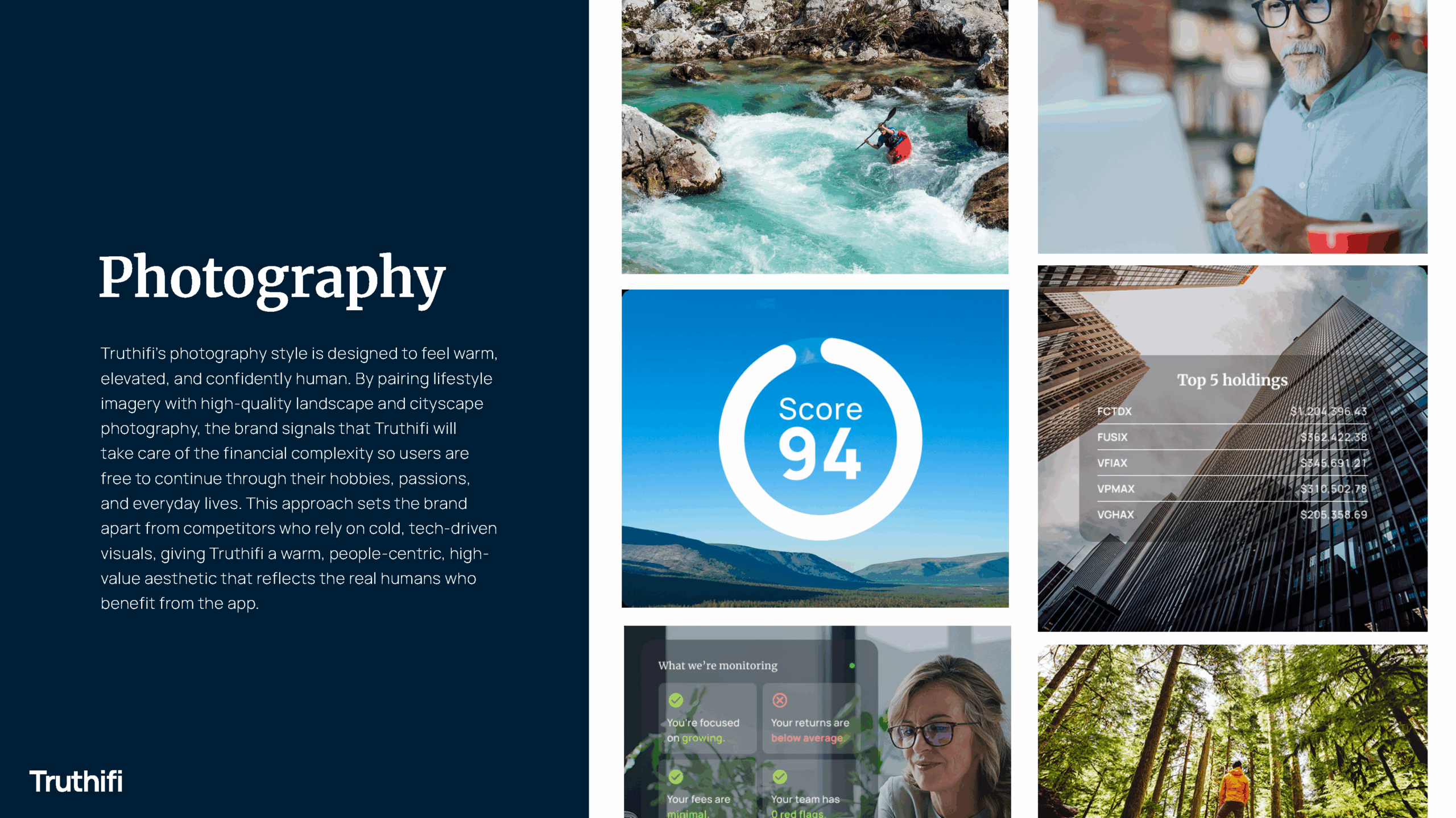
The photography direction focuses on relatable, real-world moments rather than traditional finance imagery. Natural light, candid expressions, and simple compositions help Truthifi feel accessible and grounded. The style reflects the brand’s commitment to empowering everyday investors. The warm, honest visuals bring humanity to a high-tech platform.


OUTCOME: THE FINAL TRUTH
The foundational system we developed became the springboard for Truthifi’s internal team. Equipped with clear messaging, a cohesive design language, and a conceptual UX direction, they refined and extended the work in-house to deliver their final website and marketing presence.
"As an emerging fintech company, working with the KingFish team was an outstanding experience. They guided us through brand strategy, messaging, and design with clarity and creativity, helping us shape a polished, confident visual identity for Truthifi. We’re incredibly grateful for their partnership and the quality of work they delivered.”

Scott Blanford
Founder & CEO, Truthifi
Truthifi - Financial Services / Fintech
Truthifi - Brand Strategy, Messaging, and Visual Identity
Questions about how KingFish + Partners approached this engagement - and what the work means for organizations in similar situations.
What brand work did KingFish + Partners do for Truthifi?
Truthifi, a fintech platform in the wealth management transparency space, engaged KingFish + Partners while in startup phase preparing for a capital raise. Work covered the full brand foundation: competitive landscape analysis, brand strategy, messaging and copywriting, and conceptual UX and UI direction. The brand had to serve two audiences simultaneously - investors evaluating whether to fund the company, and wealth management buyers who would eventually use the platform. KingFish + Partners built a brand balancing approachability for everyday investors with the credibility and sophistication that institutional and high-net-worth contexts require.
How do you build a fintech brand identity when the company is pre-launch?
Building a fintech brand at the pre-launch stage requires making strategic positioning decisions before the market has validated them. For Truthifi, KingFish + Partners began with competitive analysis of how investment and wealth management platforms communicate their value and frame the advisor-investor relationship. Those insights informed positioning and messaging development - ensuring Truthifi's voice felt clear, confident, and meaningfully different. Visual identity development followed the strategic brief: moodboards, color systems, typography, and UI direction driven by positioning rather than aesthetic preference alone.
What does brand strategy work for a fintech startup preparing for a capital raise involve?
Pre-raise brand work needs to communicate where the company is going, not just what it does today. Investors making a capital raise bet evaluate brand as a signal of the team's strategic clarity and market understanding. For Truthifi, KingFish + Partners built a brand narrative specific about what made the platform genuinely different in the wealth management transparency space, clear about the buyer it was built to serve, and visually sophisticated enough to compete with established players without feeling derivative. The messaging and UX concepting also gave the product, marketing, and website development teams a shared foundation to build from.
How do you differentiate a fintech brand in a crowded wealth management market?
Differentiation in wealth management technology requires resisting two temptations: competing on feature claims that other platforms make equally convincingly, and using the generic fintech visual language - blues, minimalist typography, aspirational photography - that makes every platform look interchangeable. For Truthifi, KingFish + Partners identified positioning territory that was both genuinely true to the product and unoccupied by competitors: transparency and clarity for real investors, not just affluent ones. The brand visual language evolved toward editorial elegance - rich blues, cool grays, clean layouts - projecting calm confidence rather than technological spectacle.
Has KingFish + Partners done brand work for other fintech companies?
Yes. In addition to Truthifi, KingFish + Partners has done fintech and financial services brand and marketing work for Ascot Group in specialty insurance, CSI in fintech and regtech, New York Life earning a Silver Davey Award for campaign work, and Nasdaq on a digital content experience. Financial services and fintech is one of our primary verticals. Contact us at kingfishmedia.com/contact to discuss brand work for your organization.
Next case study
Independent.
Full service.
24 years and running.
We’re always down to put heads together. Reach out to kick off a new partnership.